
- Coordinated Health
- Website Redesign
- Allentown, PA
Challenges
Before we could redesign Coordinated Health’s website, Weidenhammer had to answer an urgent question: Why were users leaving the healthcare system’s website almost as quickly as they arrived? Just as importantly, what could be done to prevent it?

Solutions
Weidenhammer conducted comparative exercises and analytics reviews. They revealed that, by and large, CoordinatedHealth.com visitors come to the site for one (or more) of four reasons: To find a doctor or specialist, find a location, schedule an appointment or make a payment.
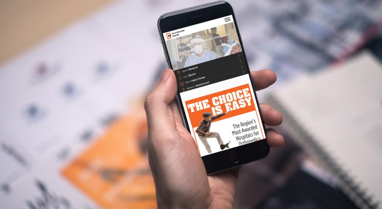
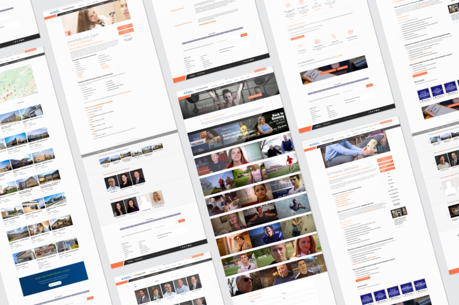
Armed with this knowledge, Weidenhammer overhauled CoordinatedHealth.com’s information architecture to eliminate guesswork and get users to their destination faster. Four new calls-to-action were given prime real estate: Meet Our Physicians, Explore the Locations, Schedule an Appointment, and Make a Payment. Designed as “hero” text scaled larger than options in the main navigation bar, these text options stay with visitors as they browse, remaining in view even as users scroll up and down through the page.
The revitalized and reconfigured CoordinatedHealth.com has led to increased online payments and fewer call center inquiries. Additional Weidenhammer-devised solutions contributing to the improved user experience include:
- Original, impactful imagery through art-directed staff photography
- Randomized imagery delivering a fresh look for returning visitors.
- An easy-to-read summary of Coordinated Health that uses numerals to convey the company’s size and mission
- New, inviting positioning for company blogs and press releases

Photography


