
- Versum
- Interactive Website
- Tempe, AZ

Challenges and Solutions
Versum’s website launch needed to coincide with the announcement of the company’s public offering – a tall order in terms of timeline, exacerbated by the site’s complex needs: a robust and easily searchable product database, a seamless transition between core content and pages hosted by NASDAQ, and customizable language features.
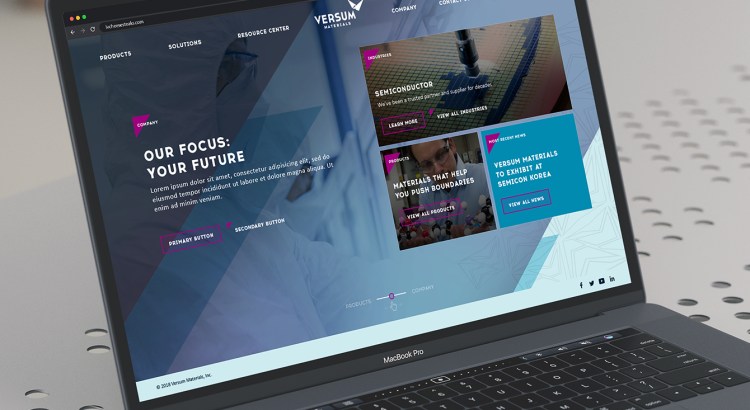
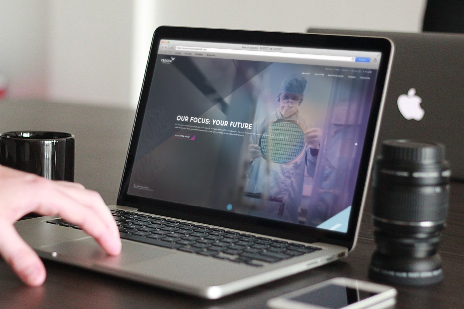
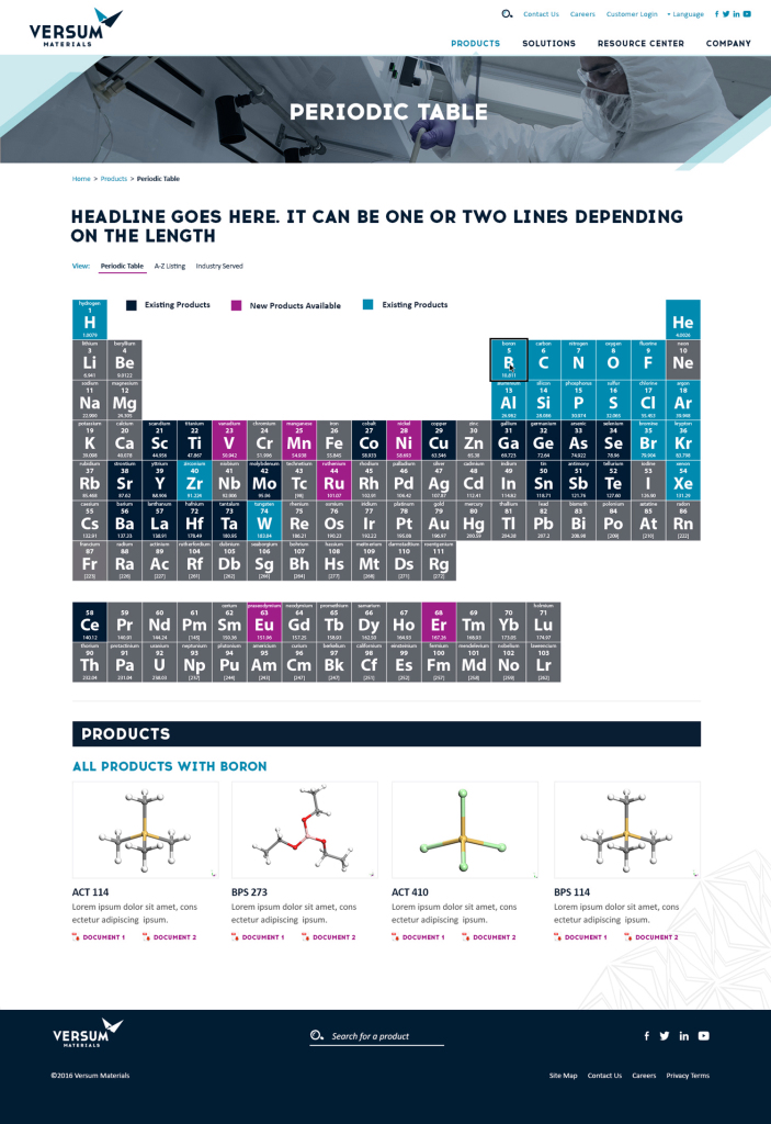
Weidenhammer handled the look and feel of Versum’s website from design through launch, merging notable design and elaborate functionality: Knowing Versum’s audience wants to search products by ingredient, Weidemhammer developed a click-through product database resembling the Periodic Table of Elements. Users select desired chemical ingredient and are led to relevant products – one of multiple ways to find merchandise, access data sheets, and see related products across the site.
It was important to Versum that, when clicking Investors in the main navigation bar, users didn’t feel like they were leaving the website – even though they are. Weidenhammer worked diligently with NASDAQ’s development team to make the transition look and feel seamless despite the fact that users are moving from one platform to another.
Weidenhammer helped select and onboard Translations.com, a proxy partner that determines users’ locations via IP address and adjusts the website’s language accordingly. Updates are similarly automated. Translation.com is pinged when Versum makes content changes, then implements them across all languages.


